

On the GMAT DI, each Graphics Interpretation (GI) page or screen will have two sentences, each with a drop-down menu. (In rare cases, there may be a single sentence with two drop-down menus.) Each drop down menu has 3-5 choices. There is no partial credit on the IR: you must get everything on the screen—i.e. both drop-down menus—correct in order to get any credit for the screen. Below are six of practice GI screens.
1) The graph below shows the different commuting options chosen by commuters in the Farview City metropolitan region in 1995 and in 2005.
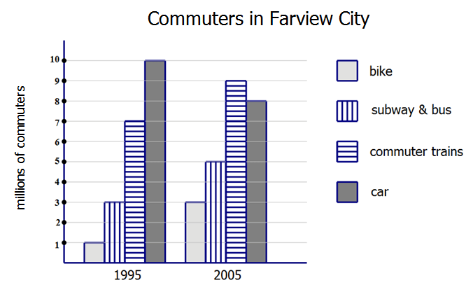
1a) The commuting mode whose ridership increased by approximately 29% from 1995 to 2005 is __________________.
1a) Assume the graph above shows all commuters in the two relevant years. In 2005, the car commuters were _______ percent of all commuters.
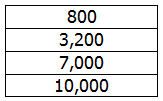
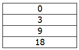
2) In a certain academic competition, there are three rounds, and three possible results in each round. The folks who “lose” acquire no commendations and do not advance to the next round. The folks who “place”, acquire a set of commendations for that round, but do not advance to the next round. The folks who “win” acquire a set of commendations for that round, and, in the case of the first two rounds, advance to the next round; in the case of the third round, the “win” means winning the entire competition. The following chart shows, on average, the percentages of participants who achieve the three results in each of the three rounds.
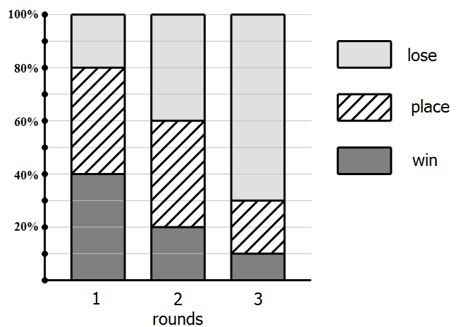
2a) If 100,000 participant start this process, and if all the percentages in the chart are correct, _______ people of them would win the entire competition.
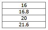
2b) Exactly _______ % of participants who start acquire exactly two sets of commendations.
3) For years, the Bethel Company had Gamma division. The year 2008 was the first year that Rho division was in operation. The chart shows the profits generated by these two divisions. Assume these two divisions were the only source of profits for the Bethel Company during these years.

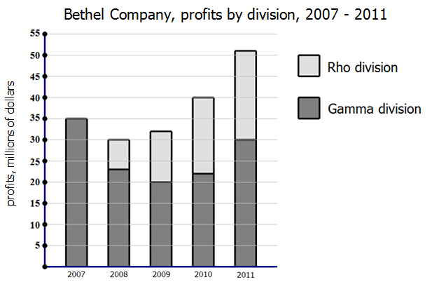
3a) In 2010 and 2011 combined, Rho division accounted for _____ % of Bethel’s profits.
3b) From 2008 to 2011, Rho division increased by ______%
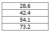
4) The charts below show the breakdown for the 2010 revenues for Goliath Corporation, a major supplier of food and food preparation materials. The pie chart shows the breakdown of sales to grocery stores. Assume these two charts contain all the revenue for Goliath Corporation.
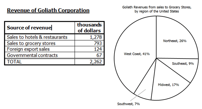
4a) The revenue from foreign export sales is __________ the revenue from grocery stores in the Northeast.
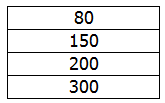
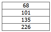
4b) Revenue from governmental contracts would have to increase by ________% to equal the revenue from grocery sales in the Midwest.
5) The graph below shows the population & land areas for eight major US cities. The area of the circle indicates the size of the GDP for the city’s extended metropolitan region.
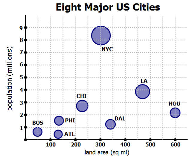
The city abbreviations are ATL = Atlanta, GA; BOS = Boston, MA; CHI = Chicago, IL; DAL = Dallas, TX; HOU = Houston, TX; LA = Los Angeles, CA; NYC = New York City, NY; PHI = Philadelphia.
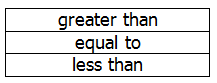
5a) Population density is the ratio of population/land area. Among the eight cities shown, __________ is the city with the lowest population density.
5b) According to this graph, the population of a city is ________________ with the size of the GDP of the metropolitan region.
6) Apex Appliances is a regional appliance retailer with multiple store through seven states. The graph below shows their performance over two calendar years, 2011 and 2012. Each dot is one month, and shows the total number of store visitors and the sales revenue from that month. The six dots with the highest numbers are store visitors are the “fourth quarter” months, October – December, of each year.
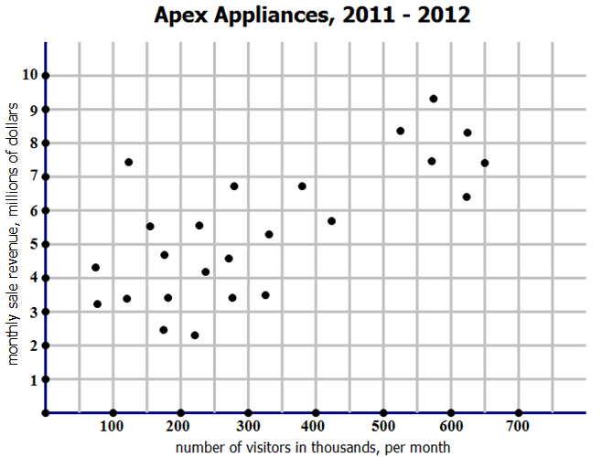
6a) During this two-year period, Apex Appliance had ________ non-fourth-quarter month(s) with higher sales revenue than the fourth-quarter month with the lowest sales revenue.
6b) In Apex’s accounting system, the “yield” of a month is the ratio of sales revenue to number of customers in that month. In the month show here with the highest yield, Apex earned _________ in monthly sales revenue.

Practice question solutions & explanations
AS a general IR rule — yes, you get a calculator. Make it your goal to touch that calculator as little as possible. You will see: we can do all of these questions without the calculator!!
1)(a) Well, we can estimate this one. A 29% increase is an increase of a little more than a quarter. Bikes tripled, so that’s way more than a quarter increase — that’s not correct.. The category “subway & bus” when from 3 to 5 million, more than a 50% — that’s not correct. Cars decreased, so that’s not correct. Even without looking at “commuter trains”, we can easily eliminate the other three. Notice “commuter trains” increased from 7 M to 9M, a 2M increase which is slightly more than one quarter of 7. That’s the answer, and we didn’t need the calculator.
1(b) In 2005, there were 8M car commuters, and 3 + 5 + 9 + 8 = 25M commuters total. That means, car users were 8/25. Multiply this fraction by 4/4 to get 32/100 = 32%.
2)(a) Suppose 100,000 start. In the first round, 40%, or 40,000 are able to “win” and advance to the second round. In the second round, 20% of 40,000 = 8,000 are able to “win” and advance to the third round. In the third round, 10% of 8,000 = 800 win the entire competition.
2)(b) How are the people who win exactly two sets of commendations? They form two groups. One group are the people who win the first round and place in the second, thus winning two commendations and not advancing. The others are the folks who win the first round, win the second round, but lose the third round, thus earning only two sets of commendations even though they advanced to the third round.
Folks who (1st = win, 2nd = place) = (0.40)*(0.40) = 0.16 = 16%
Folks who (1st = win, 2nd = win, 3rd = lose) = (0.40)*(0.20)*(0.70) = 0.056 = 5.6%
Add these: 16% + 5.6% = 21.6%
3)(a) The numbers are spread out, so this suggests we can estimate. Profits were $40M for 2010 and $51M for 2011, for a total profit of $91M over the two years. That’s our denominator. Rho accounted for $18M in 2010 and $21M in 2011, for a total contribution of $39M — that’s our numerator. What is 39/91 as a percent? Well, 30/90 = 33%, so this has to be more than 33%, and 45/90 = 50%, so this has to be less than 50%. That immediately leaves only one possible answer, 42.4%, and we didn’t have to touch our calculator.
3)(b) From 2008 to 2011, Rho increased from $7M to $21M, a three-fold increase. Be careful, though: when something triples, that’s NOT a 300% increase. No, it started at 100% ($7M), then increased by 100% (another $7M) and then another 100% (another $7M) — a 200% increase. Tripling is always a 200% increase.
4)(a) The revenue from foreign export sales is $124K. The revenue from grocery stores in the Northeast is 26%, about a quarter of $793K. Well, estimate that as $800K – about a quarter would be $200K, and $124 is much less than $200.
4)(b) The current revenue from government contracts is $67K. The revenue from grocery stores in the Midwest is 17% of $793K — estimate the number up to $800K and the percent down to 15%. The, 10% of $800K is $80K, and half of that, 5% is $40K, so add those: 15% of $800 is $80K + $40K = $120K, very approximate. That is exactly the double of $60K, and therefore close to the double of $67K. If something doubles, it increases 100%, so we want a percentage increase close to 100%. The closest is 101%.
5)(a) We will estimate this visually. For a low population density, we want the numerator, population (the vertical coordinate), to be relatively small, and the denominator, land area (the horizontal coordinate), to be relatively large. First, let’s look at Boston vs. Atlanta. Boston appears to have a higher population than Atlanta, with a lower area, so it definitely will have a higher population density than Atlanta — Boston is out as a possibility. Atlanta has a population about 0.4M and a land area about 130 sq mile. Houston has a population of about 2.2M and a land area very close to 600 sq mi. In going from the Atlanta fraction to the Houston fraction, the numerator would have to multiplied by something between 5 & 6 (from 0.4M to 2.2M) while the denominator will be multiplied by something between 4 & 5 (from 130 to 600), so in going from the Atlanta fraction to the Houston fraction, we will multiply by a fraction that has a bigger numerator than denominator, i.e. a fraction greater than 1, which makes the second fraction, the Houston fraction, bigger. Thus, the Atlanta fraction, and Atlanta has the lowest population density. (A bit dicey without the calculator, but we did it!)
5)(b) Population is the vertical scale on the graph. GDP of the metropolitan area is not a scale, but corresponds to the area of the “bubbles” on this “bubble graph”. Ignore the left-right variation — that’s irrelevant to this relationship. Notice that, as a general pattern, smaller circles are on the bottom — the bottom five circles are very close in area — and clearly the last three circles all increase in area as they increase in height. This is enough to say that: as population of the city increases, on average the GDP of the metropolitan area increase. Thus, the two are positively correlated.
6)(a) The fourth-quarter months are the six dots on the right, marked in light green. The lowest of these is surrounded by a red circle, and a horizontal line extends through this lowest point. That line marks the monthly revenue earned by this month, the lowest earning fourth-quarter month.

Notice, of the non-fourth-quarter points, the ones that remain black in the diagram, only three are above this horizontal line. Those three earned more in revenue than that lowest earning fourth-quarter month. Three.
6)(b) The orange point, circled with a red circle, is clearly the point with the highest yield. First of all, this point garnered more in revenue than all the other non-fourth-quarter points on the left. If we look at the three fourth-quarter points that are more than it — they earned only 10%-20% more profit, but had more than 4 times as many visitors —- if the numerator (revenue) is multiplied by 1.2, and the denominator (visitors) is multiplied by 4, the whole fraction gets smaller. That’s why all those four-quarter points must have a smaller yield than the circled point.
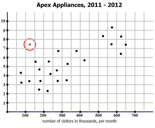
That circled point has a monthly revenue around $7.5M, or $7,500,000.
Special Note:
To find out where graphics interpretation, AKA data interpretation, sits in the “big picture” of GMAT Quant, and what other Quant concepts you should study, check out our post entitled:
What Kind of Math is on the GMAT? Breakdown of Quant Concepts by Frequency


Leave a Reply