
Fact: One common way data will displayed on GMAT Data Insights questions is in bar charts.
This post is a whirlwind overview of what you need to know about the varieties of bar charts in order to be successful with them on the new DI section.
Bars & Columns
Some sources call a graph with horizontal bars a “bar chart” and a graph with vertical bars a “column chart.” Apparently, GMAC is not interested in that distinction, because the OG 13’s section on DI calls graphs with vertical bars “bar charts”; presumably, if the bars were horizontal, GMAC would still call them “bar charts.”
A little more is at stake here than pure semantics. Typically, when the bars are horizontal, each bar represents a completely different item from some overarching category. For example:
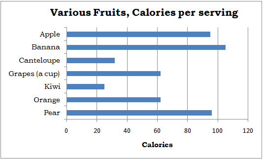
Here, the bars are different fruits. Why these fruits were selected, and not others, is not obvious. The order here is simply alphabetical, as there is no pre-determined way to put fruits into “order”, whatever that would mean. If there is no inherent order to the categories, and the representative chosen do not exhaust the category, then the data typically would be displayed in horizontal bars, what many sources would call a “bar chart.”
If the set has an inherent order to it (days of the weeks, months of the year, etc.) and/or the representative shown constitute all in the category, the data typically would be displayed in vertical bars, what many sources would call a “column chart”, but which GMAC appears to still call a “bar chart.” For example:
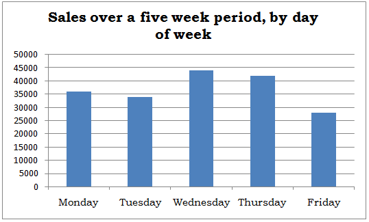
Here, days of the week have a well-defined order, in which they are displayed. Assuming this business only operates during weekdays, this is also a complete set of all the days on which they do business. That’s why the vertical columns are used.
Segmented Bars & Columns
This is a more detailed chart of the “sales by day of week” chart given above.
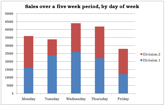
This one gives more nuanced information. Apparently, this company has two divisions, and how each division performs during different days of the week varies considerably. For example, Division 1 clearly has its best days on Wednesdays, while for Division 2, Mondays and Thursdays appear to be close to tied for best days. Here, the individual pieces are displayed as segments of a column because we might be interested in knowing either the revenues of either division separately or the total revenues of the company, which equals the sum of the revenues of the two divisions.

Clustered Bars & Columns
Sometimes we care about the sum of the parts, and sometimes we don’t. If, instead of being two divisions of the same company, those same data were interpreted as the revenues of two different companies competing in the same market, then the sum of the revenues would be virtually meaningless. In this case, the columns or bars are “clustered”, that is to say, displayed side-by-side. For example:
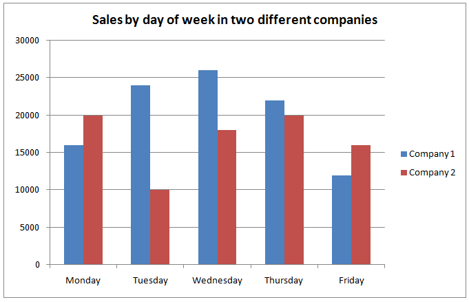
Here, the side-by-side comparison makes it very easy to compare which company outperforms the other on each day of the week.
Practice GMAT Data Insights Questions: Graphics Interpretation
The following graph shows the annual revenues of two companies, close competitors in the same market, over a recent six year period.

1) Company B’s revenues in 2005 were approximately
A) $56,000
B) $85,000
C) $132,000
D) $154,000
E) $217,000
2) Of the years shown, in the first year that Company B’s revenues overtook Company A’s revenues, how much more money did Company B earn that year?
A) $45,000
B) $63,000
C) $91,000
D) $108,000
E) $138,000
3) What was the percentage decrease in Company A’s revenue from 2007 to 2008?
A) 4.5%
B) 11.4%
C) 26.2%
D) 32.2%
E) 55.7%
4) Suppose for each year shown, we calculate the ratio of Company B’s revenues to Company A’s revenues. From 2003 to 2008, by what percent did this ratio increase?
A) 16.7%
B) 109.5%
C) 219.1%
D) 441.7%
E) 1104.4%
Practice Question Explanations
1) This first question is a very straightforward question about reading a single value from the chart. We want Company B’s profits in 2005. We look at the red column above 2005, which has a height slightly above $80K, certainly less than $90K, about halfway between them. The only answer in that ballpark is $85000, answer = B.
2) This is a slightly trickier question. First, we need to identify the first year in which Company B’s revenues overtook Company A’s revenues. This would be the first year on the chart for which the red column is higher than the blue column. The first time this happens is 2007. In 2007, A made something just above $90K, say $93K, and B made something just below $140K, say $138K. We want to know how much more Company B earned, so we subtract: $138K – $93K = $45K, and this is answer A.
3) In 2007, A made something just above $90K, say $93K. In 2008, A made something just above $960K, say $63K. For approximation purposes, let’s just round these to $90K and $60K respectively. If the revenues went from $90K in 2007 to $60K in 2008, that’s a drop of $30K, which is one-third of the starting value $90K. One-third as a percent is 33.3%, so the percentage decrease is going to be something very close to 33.3% percent. The only close answer choice is 32.2%, answer = D.
4) This is a very challenging question, about as hard as anything the GMAT is going to ask on the DI section. Notice that the answer choices are very widely spaced, which means we have free rein to approximate in answering this question. First, we have to approximate the two values of the ratio. In 2003, A earns approximately $130K, and B earns just over $20K. I’m going to approximate B’s earnings as $26K, so that both the numerator and denominator are divisible by 13. Then the ratio becomes:
ratio B:A in 2003 = 26/130 = (2*13)/(10*13) = 2/10 = 0.2
Then, in 2008, A earns just over $60K, and B earns something over $150K, so I am going to approximate them as $60K and $150K respectively. Then:
ratio B:A in 2008 = 150/60 = (5*30)/(2*30) = 5/2 = 2.5
According to our approximation, the ratio has increase by a factor of
factor = 2.5/0.2 = 25/2 = 12.5 times
Now, a tricky thing about percent increase. If I multiply by 2 (x becomes 2x), that’s a 100% increase. If I multiply by 3 (x becomes 3x), that’s an increase of 2x, a 200% increase. If I multiply by 4 (x becomes 4x), that’s an increase 3x, a 300% increase. Here, we multiply by 12.5 — x becomes 12.5 x — so that’s an increase of 11.5, a 1150% increase. The only answer even vaguely close is E.


Leave a Reply