One of the most common types of graphs is statistics and in the quantitative sciences is a scatterplot. A scatterplot is a way of displaying bivariate data: that is, data in which we measure two different variables for each participant. For example, suppose we ask several people both their age & their weight, or both their annual income & the amount of debt they carry, or both their number of kids and number of credit cards; suppose we measure for several cars both the weight and the gas mileage; suppose we measure for several public traded companies both the annual revenue and the price, per share, of their stock; etc. In all of those cases, each individual (each person, each car, each company) would be a single dot on the graph, and the graph would have as many dots as individuals surveyed or measured. Scatterplots are very popular graphs. Expect to see scatterplots on the GMAT Data Insights section.
An Example of a Scatterplot
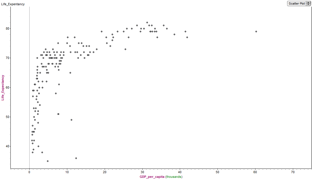
Below is a scatterplot on which the individuals are countries. Each dot is a country.
On this graph, the x-axis is the GDP-per-capita of the country. The GDP (Gross Domestic Product) is a measure of the amount of business the country conducts: the size of this depends on both the inherent wealth of the country and the population. When we divide that by the population of the country, we get GDP-per-capita, which is an excellent measure of the average wealth of the country. The y-axis is life-expectancy at birth in that country. The sideways L-shape tells the story: For countries with a GDP-per-capita above $20K, life-expectancy at birth is between 70 and 80 years, but for the poor countries, those with a GDP-per-capita less than about $20K, life-expectancy at birth varies considerably, and is in many cases considerably less than the 70+ years that is standard for most of the world.
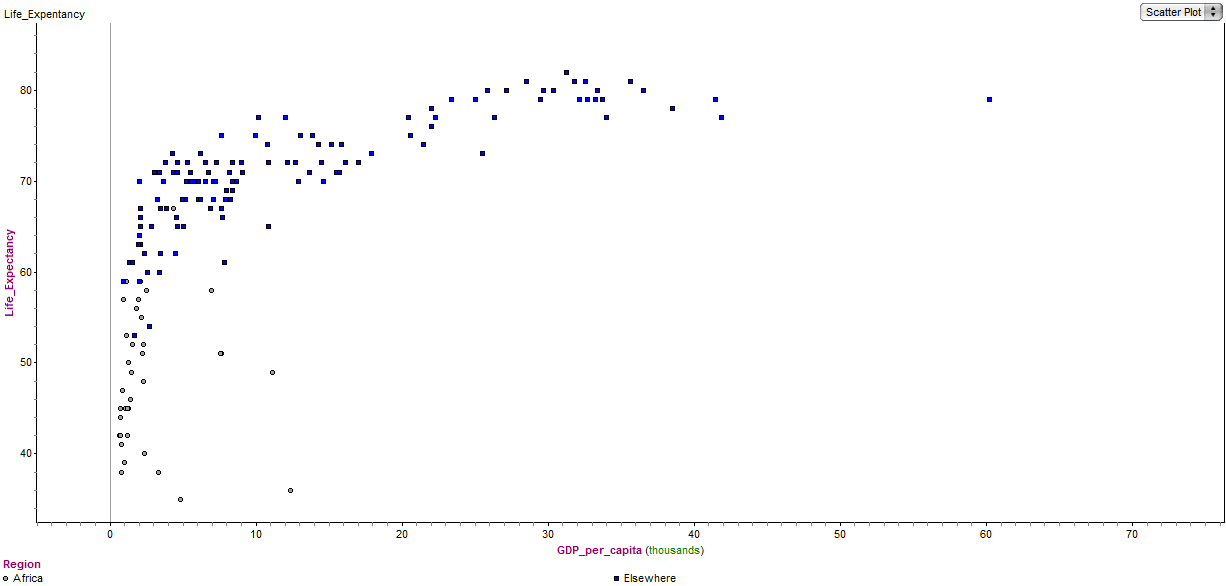
Now, as an example of a scatterplot with two different marks on the graph, here the same graph again, with some of the points marked differently.
On this graph, the grey circles are countries on the continent of Africa, and the blue squares are countries in the rest of the world. Notice that essentially, the entire continent of Africa is in the “vertical arm” of the L on the left side, while the rest of the world predominantly makes the “horizontal arm” of the L at the top of the graph. In other words, if you are born in Africa, your odds from birth are far worse than if you are born anywhere else on the planet. The international social justice implications of this are staggering, and well beyond what I can discuss here. This does, at least, give a taste of how the Data Insights section might ask you to draw a politically or ethically important conclusion from a graph. Suffice it to say: displaying data in a scatterplot can make truly important information visually apparent.
This gets to the heart of why mathematician love graphs, and why the GMAT is likely to give you graphs like scatterplots. A scatterplot makes the relationship between two variables, over a potentially large number of data points, visible at a glance. The more you practice with these graphs, the more you will appreciate their astonishing capacity to convey information in visual form.
Further practice
Where in the real world might you see scatterplots? As with much of the rest of GMAT Data Insights material, I highly recommend the New York Times, Bloomberg Businessweek, and the Economist Magazine as excellent sources that often display complex and highly relevant information in graphical form. Also, here’s a Magoosh practice question:
1) http://gmat.magoosh.com/questions/2303


