

Your Complete Guide to ACT Science Graphs and Tables
What can you expect to find when looking at ACT Science graphs and tables? I’ll go into great detail in just a minute about how to understand and approach these kinds of visuals on the exam. Before that, though, let’s examine exactly what you’ll see on the test.
On the ACT, you can expect to encounter tables and graphs of many kinds. These include tables with passages, illustrative diagrams, bar graphs, scatter plots, line graphs, and region graphs. That’s quite a diverse collection of graphics!
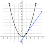
In other words, you may find yourself confronted with tables or graphs that look like any or all of the following:
But don’t worry too much about those images right now. We’ll discuss each of them and what they represent a little later on. With that in mind, this is a long post, covering everything you need to know about ACT Science graphs and tables. I highly suggest you read it all through, but if you want to just take a look at the basics or skip down to the more complicated stuff, you can use this table of contents to jump to the relevant section:
Understanding ACT Science Tables
One of the tricky parts of ACT science is the visual literacy component. By this, I mean the use of visually organized information—tables and graphs. The ACT uses a lot of scientific visuals and many of them are more complicated than the kinds of visuals you’d typically see in popular media. The good news is that these visuals can be mastered during ACT prep. The trick is to know what types of visuals you might see on the exam and to understand the components within each visual. In this post, we’ll look specifically at tables on the ACT.
Intro to ACT Science Tables
Tables contain two basic visual elements: columns (information that runs up and down the table vertically) and rows (information that displays horizontally across the table). This can be seen in the table below, which describes different kinds of geometric shapes.
In this table we see that the far left column represents different types of polygons, while the narrower columns to the right of the “polygons” column represent the number of sides, angles, vertices and diagonals (lines between two vertices) that different polygonal shapes have. There are 8 rows in this graph, each representing a different type of polygon. Reading the rows horizontally from left to right, you can see how many sides, angles, vertices and diagonals a particular type of shape has.
Reading ACT Science Tables
To understand any table, you need to understand what each column and row represents. In a straightforward table like the one above, it’s pretty easy to recognize what the columns and rows mean. On the ACT Science table below (taken from page 48 of the free practice test on the official ACT website) the purpose of each row and column is not-so-clear at a glance.
It’s easy to look at a table like this and feel overwhelmed or confused. What you need to remember is that the ACT doesn’t expect you to understand a table like this just by looking at it. The ACT will always give a full explanation of chart columns in the text of a science passage. Here is this table with full text explanation:
Now obviously, even with text it’s still not possible to identify every row and column at a glance. You have all the information you need, but putting that information together requires some careful reading. Let’s scan for words in the reading that match up to the words in the table. Here are the two key sentences, with the most important words in bold:
- A typical acid-base indicator is a compound that will be one color over a certain lower pH range but will be a different color over a certain higher pH range.
From this sentence, you can know that the column labeled “indicator” represents different chemical compounds that change colors when pH changes. - Students studied 5 acid-base indicators using colorless aqueous solutions of different pH
Now you know that the five rows labelled “Metanil yellow,” “Resorcin blue,” “Curucumin,” and so on are the specific indicator substances that change color when pH value changes. And you can understand that the broad column labelled “Color in a solution with a pH of” represents the different pH values. In turn, you can then understand that the sub-columns numbered 0-7 represent the different pH values. - The color of the resulting solution in each well was then recorded in Table 1 (B = blue, G = green, O = orange, P = purple, R = red, Y = yellow).
From this sentence, you can understand that the capital in the intersecting indicator rows and pH value columns represent the changing colors of the indicators when they’re exposed to different pH balanced solutions.
So in just three steps, you’ve defined every value in the table. This will allow you to answer table-related questions much more easily. It will also allow you to quickly understand the two similar tables that follow this table on page 48 of the practice exam.
Now, here’s the most important thing to remember: when the ACT gives you table-based questions like this, you’re being tested on the skill of interpreting scientific tables, NOT the specific knowledge of the scientific facts in the table. You may not know exactly what pH is, how pH balance can be changed in a chemical solution, or why a change in pH can change the colors of certain chemicals. And that’s OK. What’s important is that you have the reading and thinking skills you need to learn specific science information in your future university studies. The ACT measures those broad science skills and rising to this challenge will prove to universities that you’re ready to learn from college-level science courses in your future studies.
ACT Science Graphs
There are many, many types of graphs in the world. Just as there are almost infinite ways to describe something, there are near-infinite different ways to visually represent information. Fortunately, on most ACT questions, there are just five kinds of graphs you’ll need to worry about.
- Illustrative diagrams
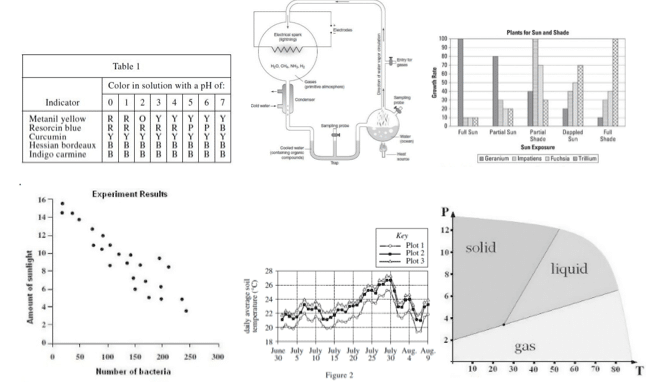
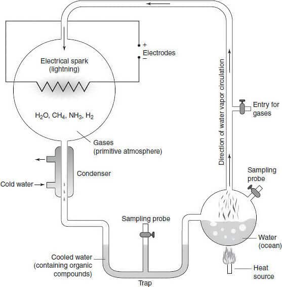
Illustrative graphs represent actual physical objects and give scientific information about them. Some illustrative diagrams can be quite elaborate, such as this graphic of a device used to study the effects of lightning on ocean water:
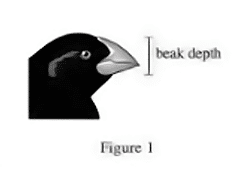
Other illustrative diagrams can be a lot simpler. Take this diagram illustrating the concept of beak depth in birds:
- Bar graphs
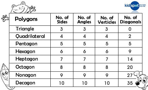
Bar graphs are the simplest form of graph on the ACT because of the straightforward way that they present information. Bar graphs in ACT also appear very often in popular media, as you might see in an article on a site such as CNN or The Week. The main difference is that ACT bar graphs will be less colorful and contain more detailed information. Here’s a typical example of an ACT-style bar graph:
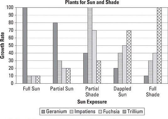
As you can see, bar graphs visually represent the amount of things with long rectangular bars. The longer the bar is for a given thing, the higher the measured numbers are. In this case, you can see the growth rate for different kinds of flowers in different environmental conditions.
- Scatterplots
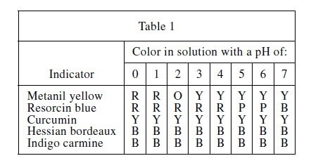
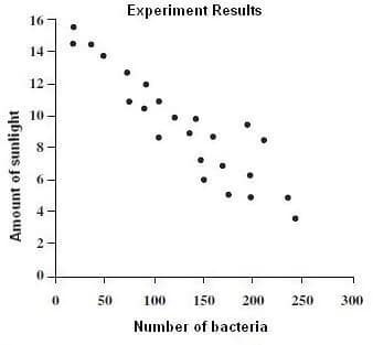
Scatterplots are graphs that show the changing relationship between two sets of data in a science study. Scatterplots are most often used to show unstable relationships, where the way one thing effects another is not 100% predictable. This scatterplot shows the relationship between sunlight exposure and level of bacteria growth. Since different types of bacteria have different sensitivity to sunlight, the number of bacteria fluctuates up and down a great deal, with more bacteria overall, when there’s less sunlight.
- Line graphs
Line graphs are similar to scatter plots and also measure a relationship between different variables in a science experiment. Basically, a line graph uses a line to connect the kinds of points you see on a scatterplot. The difference is that line graphs, with their added visual guidance, can represent multiple relationships, using lines of different color or quality to indicate different aspects of an experiment.This can be seen in a diagram from page 50 of the ACT’s official free practice test:
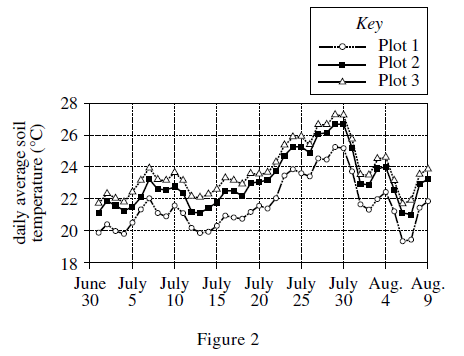
As shown, there are three different lines; a dotted line with white circles running along it, a solid line with black squares on it, and a solid line with white triangles on it. Each line represents data related to a different plot of land. In each case, the variable that’s being measured is the same: the average temperature of soil on each plot of land during different parts of the summer, measured in 5-day intervals from June 30 to August 9.
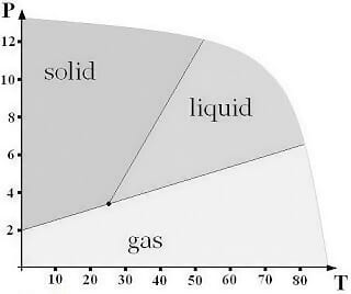
- Region graphs
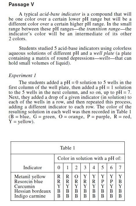
Region graphs are not quite as common as the other graphs on this list, but region graphs can and do turn up on the ACT test for many test-takers. A region graph shows different scientific properties as regions—areas on a chart. Below is a fairly simple region graph:In this graph, P represents air pressure and T represents temperature. The regions all represent physical changes in one substance. At different combinations of air pressure and temperature, the substance may take a form as a liquid, solid, or gas.
You may have found some—or all—of these graphs a little confusing to look at. And there are other, rarer ACT Science graph formats that can be even more challenging. Below, I’ll give you some strategies for reading science graphs quickly and easily, even when they deal with highly sophisticated material.

Understanding ACT Science Graphs
Some common graph types are pretty easy to read. Illustrative diagrams, for example, are what they are. They show a physical object that’s described in detail in the text and label parts of that object clearly. Bar graphs can be easy, since they are very close in format to the kinds of bar graphs seen on popular news sites, but they can still be challenging at times. A bar graph on the ACT is likely more complicated than a simpler bar graph you might see on TV news or in a magazine, and the other formats can be quite complicated, the sort of thing you don’t really see outside of a college or senior high school science textbook.
Fortunately, there are a few simple strategies that will allow you to decode even the most complicated ACT Science graphs. Read on.
Strategy 1:
Know the Parts of a Graph
Most ACT science graphs have three key components: the axis (the vertical and horizontal lines that run along the edges of a graph) the labels (words, numbers and letters that name the different things that the graph measures or quantifies) and the key (a guide to what different symbols mean on the graph).
You can see each of these parts in the graph below (from page 50 of the free practice test offered on the official ACT website)

Let’s look at each part of the graph above and the information the parts contain. The X-axis on Figure 2 and any other graph will always be the horizontal axis. In this line graph, the X-axis measures the passage of time in five day increments. The Y-axis, which is always vertical, measures the average daily temperature of soil.
The labels in Figure 2 tell you exactly what information is on each axis. “Daily average soil temperature” is clearly labeled on Y-axis, and the exact dates of the five-day intervals are clearly shown on the X-axis.
The key, which appears in the upper right hand corner above the main part of the graph, labels the different lines that run along the X-axis and the Y-axis. Each line on the key represents a different plot of land which scientists subjected to slightly different conditions.
Right now you may be wondering “Well how can I know that ‘plots’ means plots of land?” After all, the key itself just uses the word “plot,” and doesn’t explain that the graph is depicting plots of land or any details about science experiments on those plots of land. How can you know those greater details? Well, that brings me to my next strategy….
Strategy 2:
Connect the Text to the Graph
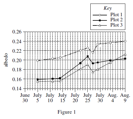
No graph on the ACT Science section exists in isolation. Every single graph is connected to the text. Without the explanation in the passage, you cannot be 100% sure how to read and use the graph. Here is the full text leading up to the graph I showed you above (note that this full text contains an additional graph):
- Drilling mud (DM) is a suspension of clay particles in water. When a well is drilled, DM is injected into the hole to lubricate the drill. After this use, the DM is brought back up to the surface and then disposed of by spraying it on adjacent land areas.
A cover of DM on plants and soil can affect the albedo (proportion of the total incoming solar radiation that is reflected from a surface), which in turn can affect the soil temperature. The effect of a cover of DM on the albedo and the soil temperature of an unsloped, semiarid grassland area was studied from July 1 to August 9 of a particular year.
On June 30, 3 plots (Plots 1−3), each 10 m by 40 m, were established in the grassland area. For all the plots, the types of vegetation present were the same, as was the density of the vegetation cover. At the center of each plot, a soil temperature sensor was buried in the soil at a depth of 2.5 cm. An instrument that measures incoming and reflected solar radiation was suspended 60 cm above the center of each plot.
An amount of DM equivalent to 40 cubic meters per hectare (m3/ha) was then sprayed evenly on Plot 2. (One hectare equals 10,000 m2.) An amount equivalent to 80 m3/ha was sprayed evenly on Plot 3. No DM was sprayed on Plot 1.
For each plot, the albedo was calculated for each cloudless day during the study period using measurements of incoming and reflected solar radiation taken at noon on those days (see Figure 1).
For each plot, the sensor recorded the soil temperature every 5 sec over the study period. From these data, the average soil temperature of each plot was determined for each day (see Figure 2).

Every label on the graph and every variable in the key is explained in the text for both figures. By reading the text you can find the definition of albedo, a potentially confusing label from Figure 1 in the second paragraph. By the third paragraph you’re told that “plots,” a word seen in the keys of both graphs, means plots of land.
Strategy 3:
Connect the Questions to the Graph
Of course, the finer points of how you need to use the graphs can’t all be found in the graphs themselves or the science reading passage. Your understanding of the graphs and their use isn’t complete until you also read the graph-related questions. Take this question for example:
- On one day of the study period, a measurable rainfall occurred in the study area. The albedo calculated for the cloudless day just after the rainy day was lower than the albedo calculated for the cloudless day just before the rainy day. On which day did a measurable rainfall most likely occur in the study area?
a) July 10
b) July 12
c) July 26
d) July 28
From this question, you learn something new about both graphs: with additional information, they can be used to determine when rainfall happened, even though the focus of the graphs is cloudless weather conditions.
Bringing All of These Strategies Together
These strategies can be pulled together in a graph comprehension checklist. Here are the simple steps you can take to understand any graph you find on the ACT:
- Check the X-axis and Y-axis of the graph and make note of what the labels say.
- Check the information in the graph key, if there is a key. (Not all ACT Science graphs have a key.)
- Double-check the text for additional information about the graph.
- Carefully check each graph-related question for more information about elements of the graph and how these elements are used.
This four-step process will allow you to understand any graph on the ACT Science test, no matter how complicated. Most graphs on the ACT are about as complex as the ones I’ve shown you in this post and the previous one, but you’re likely to come across at least one graph that’s more complicated on the ACT. When you do, the four steps above can really be a life saver. Below, I’ll show you an unusually complex graph and apply the four-step process to it.
Complicated ACT Science Graphs
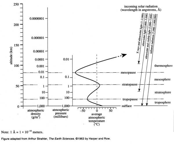
You may occasionally see other graphs that are so complicated they defy description. Here is an especially complex graph from a practice exam in The Real ACT Prep Guide, Third Edition.

It’s easy to panic when you first see a graph like this, especially on a high-stakes standardized test, but panicking would be a mistake. In fact, even thinking this graph will be significantly harder to deal with than one of the more common graph types would also be a mistake.
Just like any other graph, a complicated graph can be analyzed and understood with the use of the three-pronged strategy I gave you earlier under “Understanding Graphs”: know the parts of the graph, connect the text to the graph, and connect the questions to the graph. By identifying the parts of the graph, you’ll know where to find every variable and number in the visual, and by checking the text and questions for information that relates to the graph, you’ll know exactly what each variable and number means.
We’ll start with the first strategy: knowing the parts of graph. Like all ACT Science graphs (except for some illustrative diagrams) this graph has a horizontal x-axis and a vertical y-axis.
Along the x-axis, you see three different regions. One of them measures atmospheric density, the other measures atmospheric pressure, and the third measures average atmospheric temperature. Within the atmospheric temperature region is an upward moving, wildly swerving arrow, showing temperature change based on some sort of variable.
What variable does the temperature change over? Well, since the arrow is moving from down to up, or vertically, the variable that relates to changes in average atmospheric temperature must be on the vertical y-axis. If you look over at the y-axis, you’ll see that the variable marked along its side is altitude, this provides one clue to the swerving arrow, and to the overall relationship between x and y variables.
Don’t stop there. On an exceptionally complicated chart like this one, always check carefully to see if each axis contains any other hidden variables, ones that are not obviously connected to the axis itself, but run across a different part of the graph, either vertically (thus belonging to the y-axis) or horizontally (belonging to x).
Starting the vertical y-axis, you’ll notice there’s another set of vertically-running labels. The labels appear on the right-hand end of the graph, but they seem to be associated with lines that run all the way across the bottom half of this visual, passing through each of the three “atmospheric” regions on the x-axis.
Although some of these labels are at the very farthest right edge of the graph while others are not-so-close to the right edge, it’s best to read these labels in a strictly up-to-down vertical order, to match the vertical direction of the y-axis they sit on. Read simply from highest to lowest, these labels are: thermosphere, mesopause, mesosphere, stratopause, stratosphere, tropopause, troposphere, and surface.
Now, let’s double-check the x-axis. Are there any “hidden” horizontal variables in this elaborate infographic? It turns out there are. And they’re “hiding” in the same general area as the harder-to-spot y-variables: they’re off to the right.
In the upper right-hand part of the graph, you can see a horizontal series of labels under the heading incoming solar radiation. These labels read x-rays and ultraviolet light, ultraviolet light, ultraviolet and visible light, and infrared radiation. Notice an important visual clue here too: these horizontally arranged x-axis labels run along slightly slanted yet vertical arrows that point downward. These arrows are not completely horizontal, and they go through the vertical y-axis regions for thermosphere, mesopause, etc. Thus, it’s very likely that these incoming solar radiation variables have a relationship with the “-sphere” and “-pause” regions on the y-axis.
So through methodical checking of all vertical and horizontal labels on each part of the graph, you now have a clear idea of the variables that are involved, by name at least. You also have at least some idea of the nature of the variables. These variables connect to each other in some way, and are related to altitude and atmospheric conditions.
From here, you’ll be ready to get a truly complete idea of the graph’s meaning, by connecting its parts to information in the reading passage and the questions. We’ll deal with the second strategy, using the reading passage to better understand the graph, below.
Above, I showed you an unusually complex ACT Science graph. This visual looks intimidating at a glance, but can be mastered by using the three graph-interpretation strategies that work for other more common types of ACT Science graphs. Strategy 1, which we went through step-by-step in part 1, is to identify each part of the graph.
By applying this strategy to the complex graph in question (pictured below) you can see that the horizontal x-axis has regions for the variables of atmospheric density, atmospheric pressure, average atmospheric temperature, and incoming solar radiation (with its four variable subcategories, x rays and ultraviolet light, ultraviolet light, ultraviolet and visible light, and infrared radiation).
You can also see that the vertical y-axis has regions for the variable of altitude, as well as eight variables that seem to occur at different altitudes: thermosphere, mesopause, mesosphere, stratopause, stratosphere, tropopause, troposphere, and surface.
Finally, by scrutinizing this graph, you can notice diagonal and zig-zagging arrows that move through the x and y axes simultaneously, hinting at possible relationships between x-axis and y-axis variables.

Recognizing the parts of this graph can help you make some educated guesses as to what it all means. However, you’ll need more than just educated guesses to get a top score in ACT Science.
To get a more complete concept of what this graph means, let’s look at the reading passage associated with the graph (both the graph and passage are from The Real Act Prep Guide, Third Edition):
- Certain layers of the Earth’s atmosphere absorb particular wavelengths of solar radiation while letting others pass through. Types of solar radiation include X-rays, ultraviolet light, visible light, and infrared radiation. The cross section Earth’s atmosphere below illustrates the altitudes at which certain wavelengths are absorbed. The arrows point to the altitudes at which solar radiation or different ranges of wavelengths are absorbed. The figure also indicates the layers of the atmosphere and how atmospheric density, pressure, and temperature vary with altitude.
This is a very short passage, but a powerful one! Every form of solar radiation named on the graph is in the text. And you can now explicitly understand that the “incoming solar radiation” is absorbed or partly absorbed at different layers of the earth’s atmosphere.
Moreover, with the passage’s reference to atmospheric layers, you can easily infer that the labels thermosphere, mesopause, mesosphere etc… indicate the names and locations of atmospheric layers.
From there we can be sure of the meaning of the arrows. The wavy line in the average atmospheric temperature region of the graph shows temperature fluctuations within different layers of the atmosphere, and the diagonal arrows under incoming solar radiation show the ways that different types of rays from the sun penetrate various parts of Earth’s atmosphere.
So now you’ve effectively deciphered the entire graph. However, with a graph this complex, figuring out the meaning of everything doesn’t necessarily give you a full understanding of how the infographic is used, and exactly what kinds of information can be gotten from it.
For this, you need to use the third chart-reading strategy: connecting the questions to the graph. You know if you’ve practiced ACT questions before, questions on the exam don’t just ask students to give answers, they also give new information to test-takers. Below, we’ll look at a few of the questions associated with this graph and connect them to the image to get an even more complete idea of its meaning.
Connecting the Graph and the Question
Above, we looked at a very complicated graph (pictured below) taken from a science section in The Real ACT Prep Guide, Third Edition. Then we saw that even the most complex infographics can be deciphered in the same way as the simpler, more common ACT Science graph types. Any Science graph can be decoded by using the three graph comprehension strategies explained above.
In Parts 1 and 2, we went through two of these three key strategies: recognizing the parts of the graph and connecting the graph to the reading passage.
Just by looking at the graph, we can clearly see all of the variables on the x-axis (horizontal) and the y-axis (vertical). From left to right along x, we see regions for atmospheric conditions (density, pressure, and average temperature) and a band of four different categories of incoming solar radiation. And from top to bottom along y, we see markers for altitude and layered labels that read thermosphere, mesopause, mesosphere, stratopause, stratosphere, tropopause, troposphere, and surface.
And once you apply strategy two and read the passage (inset below), the full meaning of the graph comes into focus: the graph labels different layers of the atmosphere, indicates the layers’ ranges of altitude, shows how atmospheric density and pressure steadily changes with each different layer, shows average temperature fluctuation across the layers, and indicates the way that different types of solar radiation either penetrate atmospheric layers or are absorbed by the layers.
Passage:
- Certain layers of the Earth’s atmosphere absorb particular wavelengths of solar radiation while letting others pass through. Types of solar radiation include X-rays, ultraviolet light, visible light, and infrared radiation. The cross section Earth’s atmosphere below illustrates the altitudes at which certain wavelengths are absorbed. The arrows point to the altitudes at which solar radiation or different ranges of wavelengths are absorbed. The figure also indicates the layers of the atmosphere and how atmospheric density, pressure, and temperature vary with altitude.
Between the passage that describes the graph and the various elements on the graph itself, you get a reasonably complete idea of what the graph means. However, sometimes it can be hard to fully understand every way a graph can be used, and every kind of information that can be extrapolated from a graph. This can be true even for the simpler, more common types of ACT Science graphs. This is absolutely true for a complicated graph like the one above.
This is where the third strategy for understanding ACT Science graphs comes in by using the actual test questions to gain a complete, sufficient understanding of the infographic. ACT Science questions can sometimes provide new information about a graph, and the question set as a whole acts as a guide to help you correctly and interpret informational images.
There are five questions for this particular graph and passage (found on page 195 of The Real ACT Prep Guide). The first question asks you to identify the upper boundary of one of the atmospheric layers, and indicates that this upper boundary has name marked ending in ‘sphere’. This makes it much more obvious that the labels ending in ‘pause’ represent the boundaries of atmospheric layers, an important distinction that test-takers might not catch by just looking at the graph and reading the passage.
Another question asks about how air temperature is influenced by solar radiation at different atmospheric levels. This helps test-takers understand that radiation influences the uneven temperature flux across atmospheric layers, as marked by the “zig-zag” arrow within the average atmospheric temperature region of the graph.
These are just two examples, in this ACT Science subsection, all five questions provide further insight into some aspect of the graph. As I said, this third strategy is vital to understanding the most complex infographics you’ll see in ACT Science.
The Takeaway
In the sections above, I looked in great detail at the three strategies for understanding ACT Science graphs, which include, recognizing the parts of the graph, connecting the reading to the graph and using the questions to learn even more about the graph. These three approaches will work on any graph in ACT Science. Once you get the hang of these ACT Science skills for interpreting visuals, you’ll be able to understand both simple and complex graphs on the ACT with similar ease. If you need more science practice, check out Magoosh ACT prep.
Happy studying!


Leave a Reply