GRE Math: Histograms

First, a practice question about the following scenario.

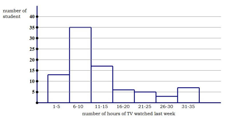
In a survey, 86 high school students were randomly selected and asked how many hours of television they had watched in the previous week.  The histogram below displays their answers.

newest histogram


1)

Improve your GRE score with Magoosh.


Histogram

First, a reminder on histograms.  Histograms are not simple bar or column charts.   A histogram, like a boxplot, shows the distribution of a single quantitative variable.  Here, we ask each high school student, “How many hours of TV did you watch last week?”, and each high school student gives us a numerical answer.  After interviewing 86 students, we have a list of 86 numbers.  The histogram is a way to display visually the distribution of those 86 numbers.

The histogram “chunks” the values into sections that occupy equal ranges of the variable, and it tells how many numbers on the list fall into that particular chunk.  For example, the left-most column on this chart has a height of 13: this means, of the 86 students surveyed, 13 of them gave a numerical response somewhere from 1 hr to 5 hrs.  Similarly, each bar tells us how many responses were in that particular range of hours of TV watched.


The median

The median is the middle of the list.  Here, there is an even number of entries on the list, so the median would be the average of the two middle terms — the average of the 43rd and 44th numbers on the list.   We can tell that the first column accounts for the first 13 folks on the list, and that the first two columns account for the first 13 + 35 = 48 folks on the list, so by the time we got to the last person on the list in the second column, we would have already passed the 43rd and 44th entries, which  means the median would be somewhere in that second column, somewhere between 6-10.


The mean

To calculate the mean, we would have to add up the exact values of all 86 entries on the list, and then divide that sum by 86.   In a histogram, we do not have access to exact values: we only know the ranges of numbers — for example, there are seventeen entries between 11 hrs and 15 hrs, but we don’t know exactly how many students said 11 hrs, how many said 12 hrs, etc.   Therefore, it is impossible to calculate the mean from a histogram.  No one will ask you to do that.  No one could reasonably expect you to do that, precisely because it is, in fact, impossible.


Median vs. Mean

If it’s impossible to calculate the mean, then how in tarnation can the GRE expect us to compare the mean to the median?   Well, here we need to know a slick little bit of statistical reasoning.  Consider the following two lists:

List A = {1, 2, 3, 4, 5}

median = 3 and mean = 3

List B = {1, 2, 3, 4, 100}

median = 3 and mean = 22

In changing from List A to List B, we took the last point and slid it out on the scale from x = 5 to x = 100.  We made it an “outlier“, that is a point that is noticeably far from the other points.    Notice that median didn’t change at all.  The median doesn’t care about outliers.  The median simply is not affected by outliers.   By, contrast, the mean changed substantially, because, unlike the median, the mean is sensitive to outliers.

Now, consider a symmetrical distribution of numbers — it could be a perfect Bell Curve, or it could be any other symmetrical distribution.   In any symmetrical distribution, the mean equals the median.  Now, consider an asymmetrical distribution: if the outliers are yanked out to one side, then the median will stay put, but the mean will be yanked out in the same direction as the outliers.   Outliers pull the mean away from the median.   Therefore, if you simply notice on which side the outliers lie, then you know in which direction the mean was pulled away from the median.  That makes it very easy to compare the two.  The comparison is purely visual, and involves absolutely no calculations of any sort.   (Yes, sometimes you can “do math” simply by looking!)

Having read this, you may want to look at the QC above before reading the solution below.


Practice problem explanation

1) If you think you have to calculate both the median and the mean, then this question would be impossible, since it’s impossible to calculate the mean from a histogram.   If you know the trick discussed above, then all we have to notice is that the outliers, the points most distant from the central hump, are at the upper end.  They are on the “high side” of the hours scale.  The median probably just sits inside that central hump, but the mean has been pulled away from the median in the direction of the outliers, that is, in the direction of the high side of the scale.   That means, the mean is higher up on the hours scale than is the median.  That means, the mean is greater than the median.  Answer = A

Notice, this solution involves zero calculations.  It is 100% visual.


Most Popular Resources

Author

  • Mike MᶜGarry

    Mike served as a GMAT Expert at Magoosh, helping create hundreds of lesson videos and practice questions to help guide GMAT students to success. He was also featured as "member of the month" for over two years at GMAT Club. Mike holds an A.B. in Physics (graduating magna cum laude) and an M.T.S. in Religions of the World, both from Harvard. Beyond standardized testing, Mike has over 20 years of both private and public high school teaching experience specializing in math and physics. In his free time, Mike likes smashing foosballs into orbit, and despite having no obvious cranial deficiency, he insists on rooting for the NY Mets. Learn more about the GMAT through Mike's Youtube video explanations and resources like What is a Good GMAT Score? and the GMAT Diagnostic Test.

More from Magoosh

27 Responses to GRE Math: Histograms

  1. Arjun Abbey August 22, 2019 at 3:47 am #

    Hi Mike

    In your GRE Data Interpretation lessons you mention that DIs dont usually have QC questions so can we expect a question like this in the actual GRE?

    • Magoosh Test Prep Expert
      Magoosh Test Prep Expert August 22, 2019 at 8:16 am #

      Hi Arjun,

      Even if DI questions don’tusually appear as QC questions, that doesn’t mean they won’t! There’s no way to predict if this type of question will come up on your GRE, but if you are looking for a top score then you should be comfortable answering questions like this. If this was particularly hard for you, it’s a good idea to analyze your practice and determine how best to approach–or skip–this type of question.

  2. nirmal October 19, 2018 at 6:20 am #

    in the histogram question it has been said that it is impossible to find the mean.But to say the mean is pulled in the direction of outlier,we need to know atleast an approximate range for the value of mean to determine in which direction the outliers will pull the mean.For example,say,In a list the mean could be less than or equal to or greater than the median.And if the mean of the list is less than the median of the list and an outlier is introduced,in this case the mean could move towards the outlier and become a value still slightly less than median.is this possible,if so then explain me for the histogram question above,how the mean number of hours of tv watched will be greater than the median number of hours of tv watch? please explain me in a step by step manner to make it easier to understand.
    thank you.

    • Magoosh Test Prep Expert
      Magoosh Test Prep Expert October 24, 2018 at 10:36 am #

      Hi Nirmal,

      I understand your confusion here; let’s see if I can clear it up for you! An outlier is a value that is much larger or much smaller than the majority of the values in a given set. In this case, we found that the median is somewhere in the second column, between 6 and 10. But if we look at the histogram, we see that the values go all the way up to 31-35, and there are several students who fall on that end of the spectrum. Given that the values start at 0 and the median is between 6 and 10, 30 is a much larger number than most of the values. This is a determination that we must make given the information provided to us, but it is fairly obvious in this data set that there are extreme values on the upper end of the set. Since we must rely on the information that we can see and infer on the histogram, the GRE will generally provide examples that are obvious. In this case, the extreme values will pull the mean above the median, which is not influenced at all by extreme values. You can read more about the relationships between mean, median and mode in this blog post: https://magoosh.com/gre/2014/mean-median-and-mode-on-the-gre/

  3. Rupom Bhattacharjee March 7, 2018 at 7:30 am #

    Hi Mike,

    I have a query. you just told that, when the outliers are in the left side of the mean then the mean will be less the the median. But, as we know those charts express the values of the variables almost always in the ascending order ( e.g 6-10, 11-15…), therefore the outliers will always be in the right side of the median, which will make the mean always greater than the median depending on the values of outliers.
    Isn’t it true? or I am missing something?

    • Magoosh Test Prep Expert
      Magoosh Test Prep Expert March 10, 2018 at 12:31 pm #

      Hi Rupom,

      I think I understand your question here, but please let me know if I’m misunderstanding something! From what I understand, you are saying that outliers must be much higher than the norm (to the right of the rest of the values on the ascending number line). However, an outlier is just an atypical value, or a value that is far from the rest of the values. Outliers can be much larger OR much smaller than the rest of the values. So, the outliers can be to the right of the rest of the numbers on the number line (which would pull the mean lower than the median) or they can be to the left of the number line (which would pull the mean above the median). Both situations are entirely possible! Does this answer your question?

  4. Roshan Shrestha January 23, 2017 at 9:07 pm #

    Mike, in this example of List B = {1, 2, 3, 4, 100}, the mean should have been 22 rather than 21 🙂

    • Magoosh Test Prep Expert
      Magoosh Test Prep Expert January 24, 2017 at 9:34 am #

      Hi Roshan,

      You’re absolutely correct! Thanks for catching this typo. We definitely appreciate when our Magoosh family provide us feedback to help us catch these little typos! 🙂

  5. Yeasir Mohammad Akib September 15, 2016 at 9:35 am #

    Hey mike, so the median is in the second column and the mean is in the higher range of hour scale. Am I right?

    • Magoosh Test Prep Expert
      Magoosh Test Prep Expert September 17, 2016 at 6:37 am #

      Correct!

  6. Yeahia September 20, 2015 at 12:25 pm #

    Can i infer from this bar chart that if there are more numbers of bars in the right side then mean will greater than median, but if there are more numbers of bars in the left side then mean will less than the median?

    • Ibonne Mejias January 20, 2016 at 12:54 pm #

      Hello, Yeahia. In this example, the graph is not a bar chart, it’s a histogram. There are differences between them. Magoosh has topics about bar chart and histogram. You can check them 🙂
      You’re right about the inference. Mean could be greater than median or less than median If outliers are far way from the median, right or left. In this case, the outlier is 31-35, so mean is greater than the median.
      When we observe the direction of the outliers, we can infer whether median or mean are greater than or less than each other.

  7. Mohammad September 16, 2015 at 10:24 am #

    Hi Mike

    I wanna first thank you very much for affording us with great video lessons. I love all of them. Very helpful!

    However, I am bit struggling here. You first said, that the median will be somewhere between 6-10. Then you say the median sits in the middle hump of 16-20, and because the outliers are on the left side of the middle hump, the mean is greater than median? I am completely lost!

    “The median probably just sits inside that central hump, but the mean has been pulled away from the median in the direction of the outliers, that is, in the direction of the high side of the scale. That means, the mean is higher up on the hours scale than is the median. That means, the mean is greater than the median.”

  8. Tanya June 27, 2013 at 12:20 pm #

    Hi Mike,

    For some reason, I’m just not understanding the explanation. In this case, if we were to actual calculate the median, it would be somewhere between 6 and 10, yes? But I feel like since such a large number of students take between 6-10 classes, then the mean would also be around that? Can you explain this post a little further? I understood your 1,2,3, 100 example but somehow that’s not translating over to this particular histogram for me.

    Sorry if this question seems very obvious.

    Thank you!
    Tanya

    • Mike MᶜGarry
      Mike June 27, 2013 at 1:55 pm #

      Tanya,
      First of all, what you are asking is not obvious — these are tricky ideas. When the distribution is symmetrical, the mean & median are relatively close. When outliers (values far from the median) asymmetrically reach out on one side, they drag the mean in that direction. The mean is “sensitive to outliers” — it is pulled in the direction of the long arm of a distribution.
      In this scenario, think of that little hump in the 31-35 range — each one of those values will enormously raise the mean. Think if you have one value of 32 and one value of 8 — the average is 20. It would take several 8’s to pull the average with that one 32 value down to the 6-10 range (the average of one 32 and eleven 8’s is 10). Well, we have not one value in the 31-35 range, but *seven* values in that highest range, and then three in the next highest, and etc. So many large numbers — there are just not enough small numbers to pull the average down to the 6-10 range.
      This is tricky stuff. It might actually help to create a list of numbers that satisfies this distribution and find the mean & median for yourself. Nothing builds intuition for math like handling real live numbers!
      Does all this make sense?
      Mike 🙂

  9. Sri April 5, 2013 at 11:43 am #

    Hi Mike,

    In the solution, When you said ” ….then all we have to notice is that the outliers, the points most distant from the central hump, are at the upper end. They are on the “high side” of the hours scale. The median probably..” This means right side region of x axis (hours scale), right?

    • Mike MᶜGarry
      Mike April 5, 2013 at 4:00 pm #

      Yes, that’s it.
      Mike 🙂

  10. nisarg April 3, 2013 at 12:54 pm #

    Hey, if you take the lowest values for all bars and calculate the mean, the mean falls in 6-10 range, which makes it ambiguous.

    • Mike MᶜGarry
      Mike April 3, 2013 at 3:10 pm #

      Nisarg,
      I revised the histogram, so this is no longer the case. The point is —- when ETS gives you a histogram as part of a GRE problem like this, this visual trick will work. Does that make sense?
      Mike

      • nisarg April 4, 2013 at 11:51 pm #

        Okay cool. Thanks 🙂

        • Mike MᶜGarry
          Mike April 5, 2013 at 10:00 am #

          You are quite welcome. Best of luck to you.
          Mike

  11. Patrick December 8, 2012 at 12:43 am #

    I got lost at this statement ” For example, the right-most column on this chart has a height of 17:”
    The right most column that I am looking at has around 3 people who watched between 31-35 hours. What am I not seeing?

    • Mike MᶜGarry
      Mike December 8, 2012 at 11:29 pm #

      Patrick: I’m sorry — I had to change the graph, and didn’t see all the text in the article that had to be changed to account for the new graph. Thank you for asking about this: I think now the text is fully updated. Let me know if you have any further questions.
      Mike 🙂

      • Patrick December 9, 2012 at 12:33 am #

        Thanks,

        I already am struggling with the math section, so this post got me completely lost, but it makes sense now.

        Patrick

        • Mike MᶜGarry
          Mike December 9, 2012 at 1:58 pm #

          Sorry about any confusion. I’m very glad it make sense now. Best of luck to you.
          Mike 🙂

  12. Benjamin December 6, 2012 at 8:25 am #

    Hi Mike,
    One little question, I think this histograms is slightly different than the list A, B thing.

    Let’s assume that the height ( total people ) for teenages who watches TV for 6-10 hours/week is extremly high. By doing this it will pull the mean back to this group, namely who watches TV for 6-10 hours/week, and if the heigh is comparatively much more higher that the outliner group, the mean will be extremely closer to the median, but nevertheless, still smaller than the median. But suppose the 1-5 hours group has a huge amout of teenages, I guess it will counterbalance the mean, which means pull the mean further back, then we’ll have problem deciding the mean and median…..

    • Mike MᶜGarry
      Mike December 6, 2012 at 1:55 pm #

      Benjamin. It’s true, I whipped up the original histogram somewhat quickly, and technically, there was a way to arrange all the values so that, if they fell in precisely the right way, the mean could be slightly smaller than the median. Basically, I didn’t plan as carefully as ETS regularly does. What appears now is a new histogram, and I contend that no matter how you arrange the values within those categories, it’s impossible to get a mean less than the median. This is actually the situation ETS will always give you — one in which every possible calculation accords with what the visual cues tell you. Does this make sense?
      Mike 🙂


Magoosh blog comment policy: To create the best experience for our readers, we will only approve comments that are relevant to the article, general enough to be helpful to other students, concise, and well-written! 😄 Due to the high volume of comments across all of our blogs, we cannot promise that all comments will receive responses from our instructors.

We highly encourage students to help each other out and respond to other students' comments if you can!

If you are a Premium Magoosh student and would like more personalized service from our instructors, you can use the Help tab on the Magoosh dashboard. Thanks!

Leave a Reply