One of the most important skills you need to master for success on the ACT Science test is how to quickly and accurately determine trends and patterns in figures and tables.
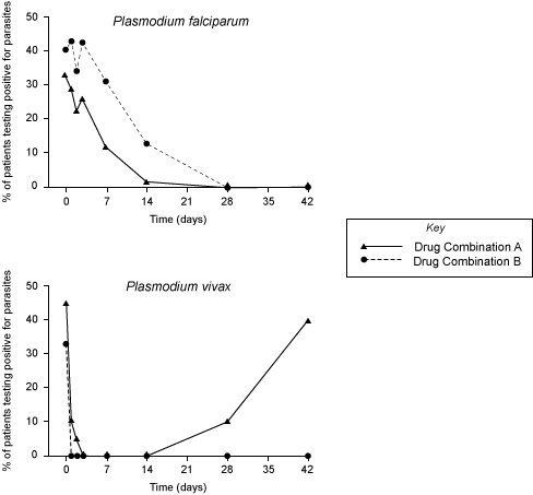
Imagine you see the following figures on an ACT Science passage (don’t worry about understanding what they mean right now; you don’t need to):

Now imagine you see a question like this:
Between days 14 and 42, the percentage of patients testing positive for Plasmodium vivax after being treated with Drug Combination A:
A. increased only
B. decreased only
C. increased then decreased
D. decreased then increased
What do you need to know?
Well, first of all, you need to know what it means when lines slope downward or upward on a graph. We can figure this out by looking at our x-axis and y-axis. The x-axis (the horizontal axis) shows days of the study increasing from left to right, so the study is progressing in time from left to right. The y-axis (the vertical axis) shows percent of patients testing positive for parasites and the percentage values increase from bottom to top.
So this means that if a line is trending upwards as the days go on, then the percentage of patients testing positive for parasites is increasing, and if it is trending downwards, then the percentage of patients testing positive is decreasing. Note that if we look at the Drug Combination A line for Plasmodium vivax (the one with the triangles) over the course of all of the days, the line goes down, then levels out at the bottom, then shoots up again. So this is why you might see answer choices on the ACT such as C and D in the question above (in this case though, we are limited to what happens between days 14 and 42, which is different than the whole length of the study.)
Second of all, on these trend and pattern questions, you always need to make sure you are looking at the right figure. This is a common mistake students make on the ACT Science test. If you neglected the reference to Plasmodium vivax in the question and looked at the first figure for Plasmodium falciparum, you might select “B. decreased only” for your answer. But we need to look at the second figure. Now, if you correctly look at the second figure, but neglect to note that the question asks about days 14 to 42, you might incorrectly select “D. decreased then increased” because the line for Drug Combination A seems to do that over the course of the study. But if we look at the correct figure and the correct line and limit our scope to between days 14 and 22, we see that the percentage of patients infected increases only, so the answer is A.
But What If I’m Not Looking at a Graph?
Trends and patterns questions might also refer to tables of data. In this case, you don’t have lines to help you and you need to look at increases and decreases in the values in the table to help you figure out the trend.
So, imagine you see this table:

And this question:
As the percentage of patients infected with P. falciparum and treated with Drug Combination C decreased, the percentage of patients infected with P. vivax and treated with the same drug combination:
A. increased only
B. decreased only
C. increased then decreased
D. decreased then increased
This one might trip you up if you don’t note one important detail: the chart shows “percent of patients free of parasites” NOT “percent of patients infected.” This is a common way that the ACT Science test might cause you to slip up. So if we look down the column for patients infected with P. falciparum and treated with Drug Combo C, we see that the numbers of patients free of the parasite increase (this, therefore means, that the number of patients infected decrease as we go down the column.) So we are looking to read the trend going down the column, not going up the column.
I’d suggest drawing in an arrow there to keep it straight in your head:

Now we need to look at what happens to the numbers in the Drug Combination C column under P. vivax as we follow the column in this same downward direction. We can see that the percent of patients free of parasites increases from 62 to 100 then decreases from 100 to 20. So this means that the number of patients infected decreases then increases, so our answer is D. This might seem a little confusing at first, but it is a good thing to get used to, as this will pop up all the time on the test.
With all that in mind, let’s try a similar sample question!
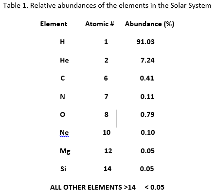
According to Table 1, as the atomic number increases from 8 to 9 to 10, the abundances:
A. decrease, then increase
B. increase, then decrease
C. decrease only
D. increase only
Note that the last line of the table indicates that the abundance of element 9 must be less than 0.05%. The abundance therefore decreases from 0.79% at element 8 to <0.05% at element 9, then increases again to 0.10% at element 10. The answer is A.
And, as we’ve seen, sometimes the pattern will be more visual than numerical:
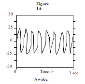
In Study 1, if the electrical activity of the resting volunteer had been measured for an additional 1 second, the voltages would have varied between approximately:
A. -5 and +5 microvolts
B. -25 and +25 microvolts
C. -50 and +50 microvolts
D. -100 and +100 microvolts
From 0 to 1 second, we can see the range was always between +25 and -25. There is no reason to assume that there would be any change if we were to continue this experiment for an additional second. The answer to this pattern question is B.
ACT Science Patterns: Vocabulary
From time to time, you will see (seemingly) more complex pattern questions in ACT Science. Don’t worry! Usually, these have to do with breaking down the vocabulary in the question and figuring out what to do with it. Some terms you might see include minimum or maximum levels, points of change, and/or direct and inverse variation.
The minimum level is the smallest data point for a given entry. The maximum level is the largest data point for a given entry. Point of change occurs when preceding data have a different relationship to the remaining data. Direct variation means that two items are directly proportional: when one increases, the other increases. Inverse variation means that two items are indirectly proportional: when one increases, the other decreases.
Finally, sometimes you will be given a graph and asked to extrapolate, or to extend the graph beyond the values on the axes to find an x-value or a y-value that is out of the given range.
A word of warning: experiments or research is explained numerically in a table or graph, and those numbers could be explained in millimeters in one table and meters in another. If you accidentally count the millimeters as meters, you could be in big trouble. Pay attention to those abbreviations and keep track of the units! Don’t let them try to fool you. 🙂
A Final Thought on ACT Science Patterns
Learning how to find patterns and trends on ACT Science tables and figures (and making sure you are following them in the right direction) is such an important skill to master to get a higher ACT Science score, so practice reading tables and figures to determine when values are increasing or decreasing, and most importantly, make sure you are looking at the right data!


