
One reason we graph data in a scatterplot is because we are looking for patterns. The simplest of all possible patterns to find on a scatterplot is a straight line pattern.
Correlation
When the points on a scatterplot lie more or less in a straight-ish line, that is called correlation. When it’s a straight line with a positive slope, going up to the right, that’s positive correlation, and when it’s a negative, slope, that’s negative correlation. To say that A and B have a positive correlation is to say that when A goes up, B goes up. Here’s an example of a graph with a very strong positive correlation.

Notice, the points are not perfectly in a line, but the upward trend is unmistakably clear. In the real world, examples of variables that are positively correlated are the price of crude oil per barrel & the price of a gallon of gasoline; the number of automobiles in a municipality & the number of traffic lights in that municipality; daily temperature & daily ice cream sales; etc.
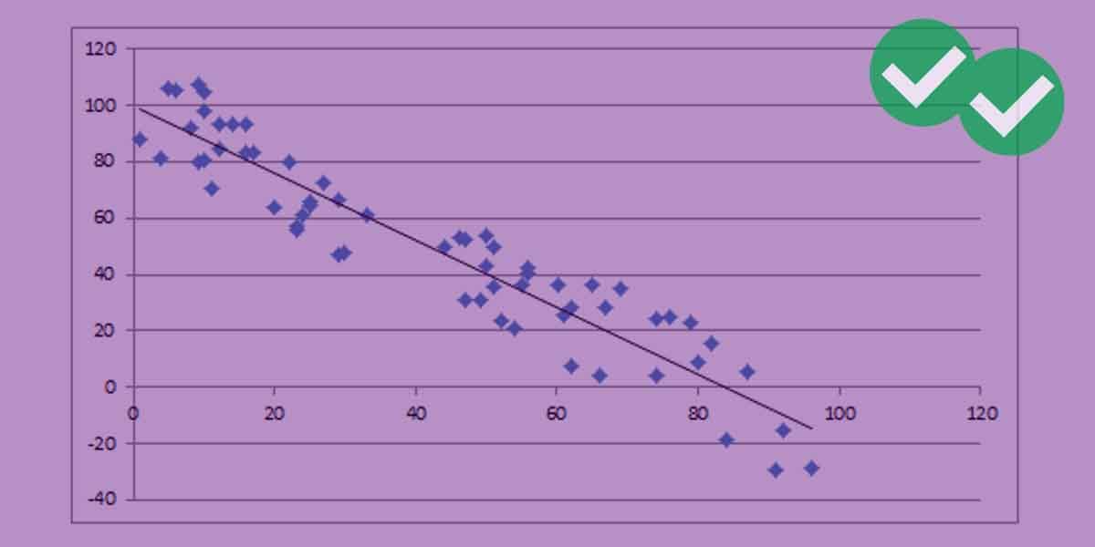
Here’s another example graph, with a very clear negative correlation.

Again, the points do not line in a perfect straight line, but the downward trend is clear: when the x-axis variable goes up, the y-axis variable does down. In the real word, examples of variables that are approximately negatively correlated are the unemployment rate & the Dow Jones average; the torque of a car’s engine & its fuel efficiency; a baseball pitcher’s career ERA & his number of career shutouts; etc.

Those two graphs were, by statistical standards, quite “pretty”: the pattern is very clear, and little of real-world messiness is evident. Here’s some real-world data, exploring that last baseball point: a baseball pitcher’s career ERA vs. his number of career shutouts.

This graph only includes career leaders (in the top 1000) in both stats. It’s much messier than the previous graphs, which is typical of real world data, but the negative trend is still apparent. BTW, that single dot way up at the top, with Career Shutouts = 110 and a career ERA = 2.17, is the great Walter Johnson, easily one of the finest pitchers of all time.
Trend Lines
For the first two graphs, we can easily imagine the straight line that would go through these points and summarize them. It’s somewhat less clear exactly where it would lie on the third “messy graph. This line, which summarizes the implicit linear trend in a scatterplot is called alternately a “trend line” or a “line of best fit.” The official name in statistics is a “least square regression line”, but the exact details about how it is calculated and all its technical properties are well beyond what you need to understand for the GMAT.
Here’s the second graph again, with a trendline.

The trend line moves through the center of the linear pattern. Here, the points are negatively correlated, so the trendline has a negative slope.
Here’s the baseball graph with its trend line.

The trendline allows us to make prediction of a typical data point. For example, here, if a pitcher has a career ERA of about 3.50, we would expect that pitcher to have, on average, about 20 career shutouts. Pitchers above the trendline had more shutouts than expected for their ERA, and pitchers below the trendline had fewer shutouts than expected for their ERA. Making a predicted y-value for a hypothetical x-value, or judging whether an individual point has a higher or lower “typical” y-value, given its x-value — this is about all the trendline analysis the GMAT will expect of you.
A Word about Correlation
This caution, about the meaning of correlation, may be more relevant to GMAT Critical Reasoning that it is to Integrated Reasoning. To say A and B are positively correlated is to say: when A is a relatively big number, so is B; and when A is a relatively small number, so is B. A and B “go together.” What it does not mean is: A causes B. If A causes B, or if B causes A, then the two variables will have a high correlation, BUT the converse is not true. As the canonical saying in the social sciences goes: correlation does not imply causality. Just because A and B appear together does not necessary mean that A directly causes B or vice versa; it may mean that both are caused by another factor, or there may be a more complex relationship. Inferring causality from correlation is a classic social science mistake: keep an eye out for this in “flawed arguments” on CR questions.
Practice Question
Here’s a free practice question involving a scatterplot with a trendline.
1) http://gmat.magoosh.com/questions/2305


Leave a Reply