
Fact: When GMAT Integrated Reasoning appears, starting in June 2012, one type of chart about which the GMAT IR can ask is a bubble chart.
What in Sam Hill is a bubble chart?
Scatterplots
A bubble chart is a close cousin to a scatterplot. In a scatterplot, each data point has values in two different variables, and for each data point, its vertical & horizontal position on the graph tells its value in those two variables. For example, here’s a scatterplot:
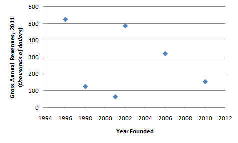
Each dot on this scatterplot is a company. The vertical position of the dot tells you the 2011 revenue of the company. The horizontal position tells you the year the company was founded. For example, there’s a company founded in 2001 that has revenues under $100K — it appears to have had 2011 revenues of around only $70K, the lowest of the six companies shown. It appears the oldest company did quite well, but then the next two oldest companies have come nowhere close to the success of the older company, while some of the younger companies have done much better. This data makes us curious: after the oldest company, why were the next two companies relatively unsuccessful, but later companies were relatively successful?
The Added Dimension of Bubble Charts
The beginning of an answer to this question shows up on the bubble chart. On a bubble chart, the center of the “bubble” is exactly like a dot on a scatterplot — it shows you the value of a horizontal and vertical variable. The size of the bubble adds a third variable. In fact, the very point of bubble charts to display data points, each of which has a value in each of three different variables. Bubble charts provide a quick way to visually display what is going on with three different variables at once.
Below is a bubble chart based on the same data. Notice: the vertical and horizontal variables are identical, so the centers of the bubbles in the chart below are exactly the same as the locations of the dots in the chart above. In this new graph, the size of the bubble introduces a new variable: number of employees.
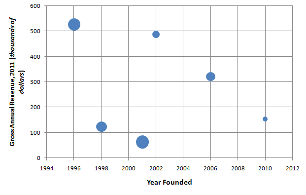
Just for a sense of scale, I’ll say that Company A (the oldest, founded in 1996) has 78 employees, and Company F (the youngest, founded in 2010) has 12 employees.
Notice how much more nuanced the story becomes now. Company A was founded first: it’s the oldest, with the largest 2011 revenues and the second largest number of employees. The next two companies were also relatively large companies, and they didn’t do well. By contrast, the fourth company, founded in 2002, is a very small company, and it has almost caught up to Company A in terms of revenue. We don’t know how this small company manages to do what it does with so few employees — a vastly superior product? the brilliant use of technology? Obviously, there’s more to the story, but notice how the size of the bubbles added a whole other dimension to the story.
Practice Questions
Here’s are some practice IR questions, along similar lines:

The graph below shows the development of Company XYZ, founded in 2001. The vertical axis shows the average number of employees each year, and the size of the dots represents the annual revenues that year.
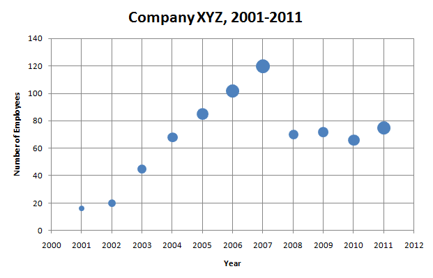
1. In what year did the company have the highest revenue?
A. 2006
B. 2007
C. 2009
D. 2010
E. 2011
2. What was the percentage decrease in the number of employees from 2007 to 2008?
A. 41.6%
B. 58.3%
C. 85.7%
D. 171.4%
E. 240%
3. Which is a clear trend for Company XYZ during the years 2003 – 2007, before the subprime mortgage crisis?
A. number of employees decreases; revenue decreases
B. number of employees stays about the same, revenue stays about the same
C. number of employees stays about the same; revenue increases
D. number of employees increases, revenue stays about the same
E. number of employees increases, revenue increases
4. Which is a clear trend for Company XYZ during the years 2008 – 2011, in the aftermath of the subprime mortgage crisis?
A. number of employees decreases; revenue decreases
B. number of employees stays about the same, revenue stays about the same
C. number of employees stays about the same; revenue increases
D. number of employees increases, revenue stays about the same
E. number of employees increases, revenue increases
Answers and Explanations
1) This is a simple read the graph question. Revenue is given by size of the bubble, so we are simply looking for the biggest bubble. The biggest bubble on the graph occurs at 2007, so the answer is B.
2) For percentage decrease, it’s important to remember the formula is:
Percent Decrease = x 100%
For anything you can count, like number of employees, it’s impossible to have a percentage decrease greater than 100%. A percentage decrease of 100% would mean employees went to zero: the company went out of business. You can’t have a negative number of employees, so the percentage decrease can never be more than 100%. Theoretically, one could talk about more than 100% decrease in something monetary, like assets or profits —- more than a 100% decrease would mean one started “in the black” and ended “in the red.”
Here, the start is about 120 employees, and the difference, the loss of employees, is about 120 – 70 = 50. Notice that 50 is less than half of 120, so this is less than a 50% decrease. The only possible answer is A.
3) During the years before the subprime mortgage crisis, from 2003 – 2007, the bubbles rise vertically year after year, indicating that employees are increasing. The size of the dots also increases steady during that five-year period, so revenues are increasing as well. This scenario is described by E.
4) During the years following the subprime mortgage crisis, from 2008 – 2011, the bubbles all hover around the same height — a little up, a little down, but not really leaving that 60-80 range. The number of employees appears rangebound, which is another way of saying: they are staying about the same. Notice, though, that starting with a small bubble in 2008, the size of the bubble steadily gets bigger, until 2011, which appears to be the third largest bubble on the chart. Revenues are definitely increases. Apparently, the wake of the subprime mortgage crisis, Company XYZ figured out how to “do more with less.” This scenario is described by C.


Leave a Reply