
So far, we’ve looked at how to answer infographic questions in How To Answer Graph and Chart Questions In New SAT Math and How To Answer Graph And Chart Questions In New SAT Reading for the New SAT. Next up, we’ll look at graphs and charts as it they’re used in the New SAT’s Writing and Language Section.
In New SAT Writing and Language, you don’t need to deeply analyze charts graphs and tables the way you might in Reading or Math. You only need to identify and understand the basic facts on the graph or chart. The real task is carefully comparing the data in the chart to writing in the passage itself, identifying errors and contradictions between the image and the passage itself.
You’ll be asked to check for two kinds of errors between passage and graphic: factual contradictions, and lack of relevance.
Here is a factual contradiction question similar to one you might see in New Sat Writing and Language:
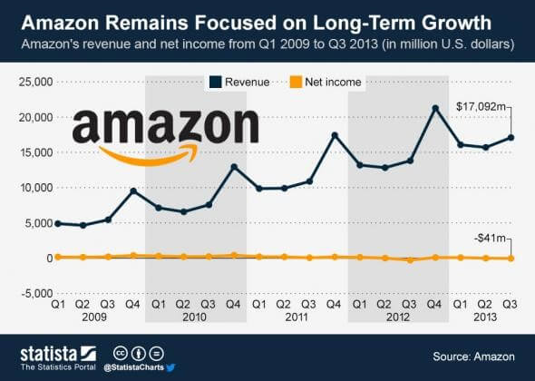
The online retailer Amazon.com saw steady increases in revenue on an annual basis between 2009 and 2013. However, within any given year revenues were dramatically higher in the fourth quarter compared to other quarters, with quarterly revenue spiking as high as $17,092 million dollars in the fourth quarter of 2012.
Practice SAT Writing Question:
Which choice most accurately and effectively represents the information in the graph?
A) NO CHANGE
B) down to 41 million dollars in the fourth quarter of 2012
C) to more than 20 million dollars in the fourth quarter of 2012
D) to more than 20 million dollars in the fourth quarter of 2012 and beyond
Answering a Writing and Language question like this one is fairly simple. Answer (C) is correct, because it’s the only choice that’s actually reflected in the infographic. All other answer choices are incorrect and could only result from a careless misreading of Amazon.com’s revenue charts. (A) is the figure from the third quarter of 2013, not the fourth quarter of 2012. (B) is a figure for net income rather than quarterly revenue. (D) mischaracterizes the 20 million figure by incorrectly suggesting the quarterly revenue never dropped below 20 million after 2012.
Now, let’s look at a sample question that focuses on both accuracy and relevance, using the same graphic:
Part of Amazon’s business success relies on their ability to anticipate low sales periods and minimize financial risk during those times. Fortunately, Amazon’s customers have predictable peaks and lows in their spending habits. Each year from 2009 to 2012 showed a net gain in sales regardless of these peaks and lows. Amazon’s board of directors takes prudent measures to insulate the company against potential financial troubles during each year’s less profitable quarters.

Practice SAT Writing Question 2:
At this point, the writer wants to add specific information that supports the main topic of the paragraph. Which choice most effectively completes the sentence with relevant and accurate information, based on the graph above?
A) NO CHANGE
B) The third and fourth quarters of each year consistently demonstrate sluggish sales and a marked drop in revenue.
C) The third quarter always sees a slight rise in revenue, but third quarter sales are lackluster in comparison to the annual fourth quarter high point.
D) The first and second quarters are always marked by low revenue and low sales volume, and the all-time annual low usually occurs in the second quarter of each year.
Here, the answer is (D). Answers (A) and (C) accurately reflect the infographic, but are not relevant to the paragraph’s main focus on the quarters that being in the lowest revenues each year. Answer (B) interprets the sales chart incorrectly, sales and revenue actually pick up in the third and fourth quarters of each year on the chart.
The Takeaway
The key to success in New SAT Writing graph and chart questions is careful reading for details. As long as you can understand what is being directly stated in the infographic and accompanying passage, you’ll be able to answer visual-related questions correctly. Just look for the facts, and make sure that all facts match up to the visuals, tone and answer choices.


Leave a Reply