
First, a practice question about the following scenario.
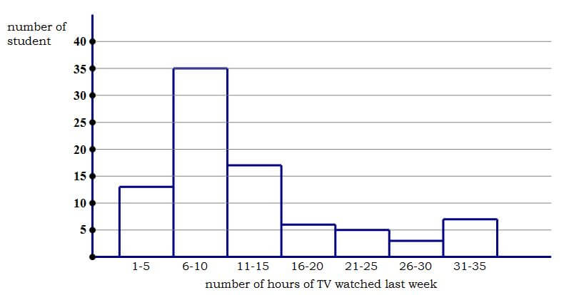
In a survey, 86 high school students were randomly selected and asked how many hours of television they had watched in the previous week. The histogram below displays their answers.
1)

Histogram
First, a reminder on histograms. Histograms are not simple bar or column charts. A histogram, like a boxplot, shows the distribution of a single quantitative variable. Here, we ask each high school student, “How many hours of TV did you watch last week?”, and each high school student gives us a numerical answer. After interviewing 86 students, we have a list of 86 numbers. The histogram is a way to display visually the distribution of those 86 numbers.
The histogram “chunks” the values into sections that occupy equal ranges of the variable, and it tells how many numbers on the list fall into that particular chunk. For example, the left-most column on this chart has a height of 13: this means, of the 86 students surveyed, 13 of them gave a numerical response somewhere from 1 hr to 5 hrs. Similarly, each bar tells us how many responses were in that particular range of hours of TV watched.
The median
The median is the middle of the list. Here, there is an even number of entries on the list, so the median would be the average of the two middle terms — the average of the 43rd and 44th numbers on the list. We can tell that the first column accounts for the first 13 folks on the list, and that the first two columns account for the first 13 + 35 = 48 folks on the list, so by the time we got to the last person on the list in the second column, we would have already passed the 43rd and 44th entries, which means the median would be somewhere in that second column, somewhere between 6-10.
The mean
To calculate the mean, we would have to add up the exact values of all 86 entries on the list, and then divide that sum by 86. In a histogram, we do not have access to exact values: we only know the ranges of numbers — for example, there are seventeen entries between 11 hrs and 15 hrs, but we don’t know exactly how many students said 11 hrs, how many said 12 hrs, etc. Therefore, it is impossible to calculate the mean from a histogram. No one will ask you to do that. No one could reasonably expect you to do that, precisely because it is, in fact, impossible.
Median vs. Mean
If it’s impossible to calculate the mean, then how in tarnation can the GRE expect us to compare the mean to the median? Well, here we need to know a slick little bit of statistical reasoning. Consider the following two lists:
List A = {1, 2, 3, 4, 5}
median = 3 and mean = 3
List B = {1, 2, 3, 4, 100}
median = 3 and mean = 22
In changing from List A to List B, we took the last point and slid it out on the scale from x = 5 to x = 100. We made it an “outlier“, that is a point that is noticeably far from the other points. Notice that median didn’t change at all. The median doesn’t care about outliers. The median simply is not affected by outliers. By, contrast, the mean changed substantially, because, unlike the median, the mean is sensitive to outliers.
Now, consider a symmetrical distribution of numbers — it could be a perfect Bell Curve, or it could be any other symmetrical distribution. In any symmetrical distribution, the mean equals the median. Now, consider an asymmetrical distribution: if the outliers are yanked out to one side, then the median will stay put, but the mean will be yanked out in the same direction as the outliers. Outliers pull the mean away from the median. Therefore, if you simply notice on which side the outliers lie, then you know in which direction the mean was pulled away from the median. That makes it very easy to compare the two. The comparison is purely visual, and involves absolutely no calculations of any sort. (Yes, sometimes you can “do math” simply by looking!)
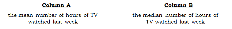
Having read this, you may want to look at the QC above before reading the solution below.
Practice problem explanation
1) If you think you have to calculate both the median and the mean, then this question would be impossible, since it’s impossible to calculate the mean from a histogram. If you know the trick discussed above, then all we have to notice is that the outliers, the points most distant from the central hump, are at the upper end. They are on the “high side” of the hours scale. The median probably just sits inside that central hump, but the mean has been pulled away from the median in the direction of the outliers, that is, in the direction of the high side of the scale. That means, the mean is higher up on the hours scale than is the median. That means, the mean is greater than the median. Answer = A
Notice, this solution involves zero calculations. It is 100% visual.


Leave a Reply